- DATE:
- AUTHOR:
- SAP LeanIX Product Team
Benefit from a more accessible and consistent workspace experience
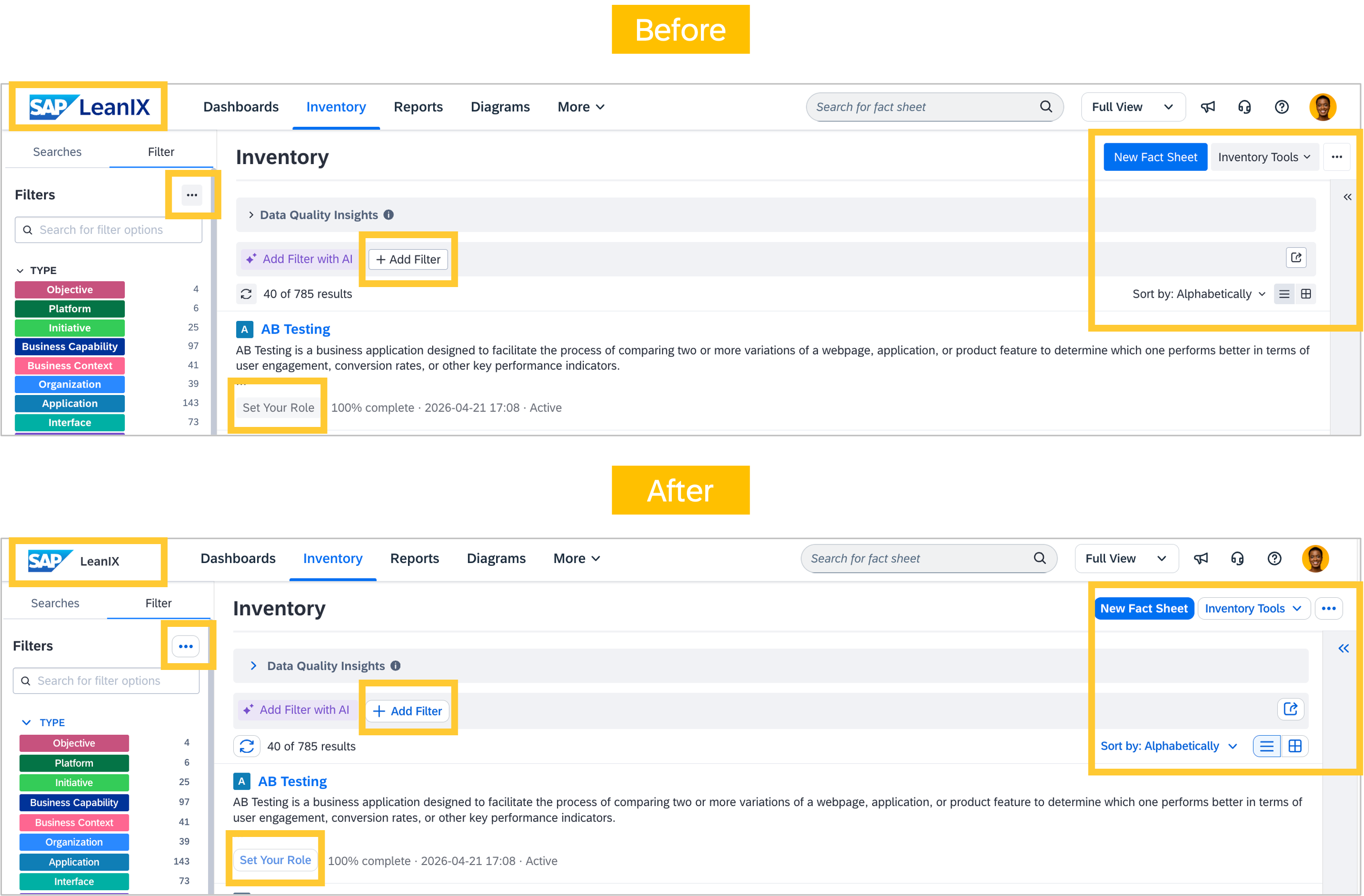
The visual update we pre-announced between May and June has completed its rollout. All workspaces now feature a refreshed appearance for common UI elements, including buttons, form elements, banners, navigation, and filters.
This update is part of a broader effort to improve accessibility by increasing contrast ratios, ensuring more consistent keyboard navigation, and aligning the workspace experience with SAP’s design standards.
No workflows, features, or behaviors have changed. Everything works exactly as before. For a broader overview of what changed visually, see our last pre-announcement, which includes additional screenshots.
Further visual updates are planned across Q3 and Q4. These will include smaller refinements to dialogs and forms, such as the fact sheet creation form and export dialogs. The most significant upcoming change is a redesign of the side navigation bar for dashboards, reports, diagrams, and the admin area, which we will pre-announce with sufficient lead time ahead of its planned release at the start of Q4.